")
IN CONVERSATION WITH THE DESIGNERS OF OUR NEW BELL LOGO
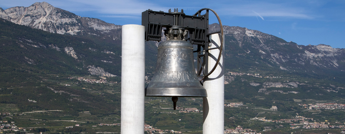
The refresh was necessary, the responsibility was great, and the turnaround was tight. 4 October – the anniversary of the Maria Dolens Bell’s first toll, and the day of our new logo’s grand reveal – was fast approaching. We needed creative people, capable of listening to our ideas and translating them into concise imagery. We entrusted the task to a design duo with an elegant, concise style: barbericonzatti.design (BC.D). Ivonne Conzatti and Luciano Barberi compare their creative approach to the art of tailoring. Their services range from design to visual work, artistic direction, and installations but their aim is always to deliver a “tailor-made” product to the client. “The Campana dei Caduti Foundation asked us to design a new logo while ensuring the bell remained recognisable and certain themes were rendered more explicit, such as peace, sound and the universality of Maria Dolens’ message”, they explained to us in a quick catch-up between meetings.
How did you approach the task?
We worked on nine proposals in close collaboration with the foundation’s senior trustees. Each proposal contained distinct and recognisable themes, and the starting points were always the themes of peace and sound.
How did you narrow down your selection?
We presented our proposals to the trustees and the two that received the highest number of votes were chosen to be put forward for a local community vote. We are interested to see which one will be chosen.
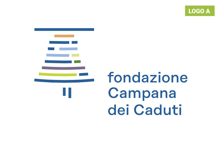
What are the ideas behind the logos? Let’s start with logo A.
The proposal for logo A stems from the concept of a bell tolling. The logo depicts the local community as a set of distinct elements. It features lines inspired by a musical stave that become softer and softer, symbolising the ringing of the bells. The colour palette is discreet and understated.
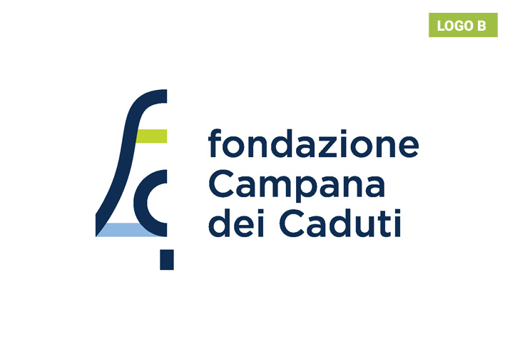
And what about logo B?
With this proposal we created an outline of a bell using the initials of the words fondazione, campana and caduti. The logo depicts the outline of the Maria Dolens bell in a contemporary key, using the foundation’s colour palette and a hint of green in homage to Rovereto, the Città della Quercia.